Introduction
If you are an Android user in India and recently noticed that your calling screen looks different, don’t worry — nothing’s wrong with your device. Google has rolled out a new user interface (UI) update for its Phone app, giving it a fresh, modern look. This update introduces Material 3 expressive elements, which not only refresh the design but also make the app more user-friendly.
Let’s take a closer look at what’s new in this update.
What’s New in the Google Phone App Update ?
The latest redesign of the Google Phone app brings visual improvements, better navigation, and more intuitive controls. Here are the key changes you’ll notice:
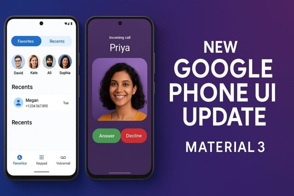
1. Redesigned Contacts Tab
Unified Tab: Your favorites and recent contacts are now placed in a single tab for easier access.
Favorites Carousel: Favorite contacts appear at the top in a neat carousel format.
Recent Conversations: These are now placed in a container at the bottom, making them quick to reach.
Navigation Tweaks: The keypad is no longer a floating button. Instead, it has its own dedicated tab at the bottom.
Contacts in Menu: Contacts have shifted to the new navigation bar at the top, though you can still access them through the familiar three-dot menu.
This layout makes it easier for users to quickly dial or call back without hunting through multiple menus.
2. Incoming Call Screen Improvements
Accidentally answering or rejecting calls is a common frustration, especially when pulling your phone out of your pocket. To fix this, Google has made an important tweak:
New Swipe Action: You now need to swipe horizontally to answer or reject calls (instead of vertically).
Fewer Mistakes: This design reduces accidental touches and improves accuracy.
Customizable Option: Prefer the old way? You can still switch back to the tap-to-answer setting.
This small but smart change ensures that users won’t miss or drop calls unintentionally.
3. Updated In-Call Buttons
Once you’re on a call, you’ll notice:
Rounded Corners: Buttons on the call screen now have smoother, rounded edges.
Larger End Call Button: The red “end call” button is now more prominent, making it easier to spot and press.
These updates improve accessibility and help avoid pressing the wrong button during a call.
Upcoming Feature: Contact Cards
Google is also testing a new feature called Contact Cards. With this, users will be able to see full-screen images of their contacts on the incoming call screen.
Currently, this feature is in the beta testing phase, but once rolled out, it will make the calling experience more personal and visually appealing.
Google Clock App Gets a Redesign Too
The Google Phone app isn’t the only one getting a makeover. The Android Clock app is also receiving the Material 3 expressive redesign.
Here’s what’s changing:
A long bar at the bottom replaces the older design.
The usual circular floating button in the middle has been replaced by a square floating button in one corner.
Color-coded highlights now show which alarms are active, making it easier to manage them at a glance.
This new design makes the Clock app feel more in line with Google’s overall Material You/Material 3 aesthetic.
Why This Update Matters for Android Users
Google’s decision to roll out these changes reflects its focus on user experience. Small tweaks like horizontal swipes, rounded buttons, and visual separation of contacts might seem minor, but they improve usability significantly.
For users in India, where Android dominates the smartphone market, these updates will likely enhance everyday calling and alarm experiences.
Final Thoughts
The new Material 3 expressive redesign for the Google Phone and Clock apps marks another step in Google’s push toward a cleaner, more intuitive Android experience.
Contacts are better organized.
Incoming calls are harder to miss.
In-call controls are easier to use.
And soon, Contact Cards will bring full-screen personalization.
If you haven’t received the update yet, don’t worry — it’s rolling out gradually across regions, including India. Just keep your Google Phone and Clock apps updated from the Play Store to enjoy the latest features.

